VIETNAM AIRLINES BRAND REFRESH


In May of 2015, Vietnam Airlines launched the rollout of its updated lotus brand, represented by the images above. Thirteen years prior, the original lotus theme and unique aqua-blue color scheme designed by Kubo was introduced to the market adorning the carrier’s first Boeing 777-200ER. The new branding proved to be successful as Vietnam and its national flag carrier emerged from over a decade of internalization to become one of Asia’s largest and most successful airlines.
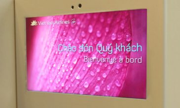
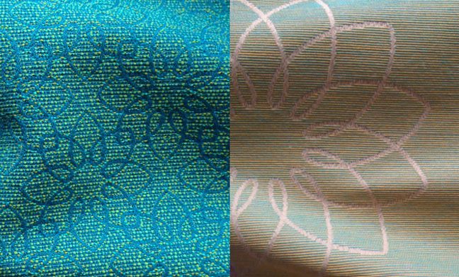
For the corporate-wide brand refresh, Vietnam Airlines retained its highly recognized lotus symbol updated with a modernized wordmark, and a brighter, livelier color scheme.
THE EVOLUTION OF VIETNAM AIRLINES’ IDENTITY
1993
ORIGINAL LOGO AND LIVERY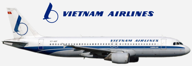
2002
KUBO REBRANDED LOGO AND 777-200ER LIVERY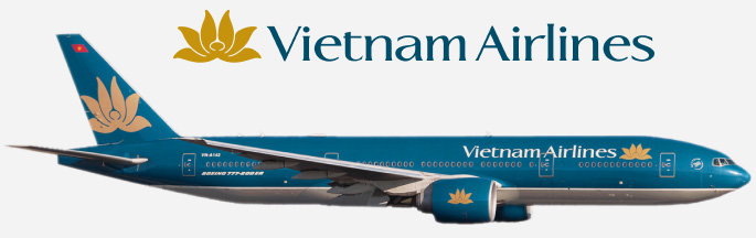
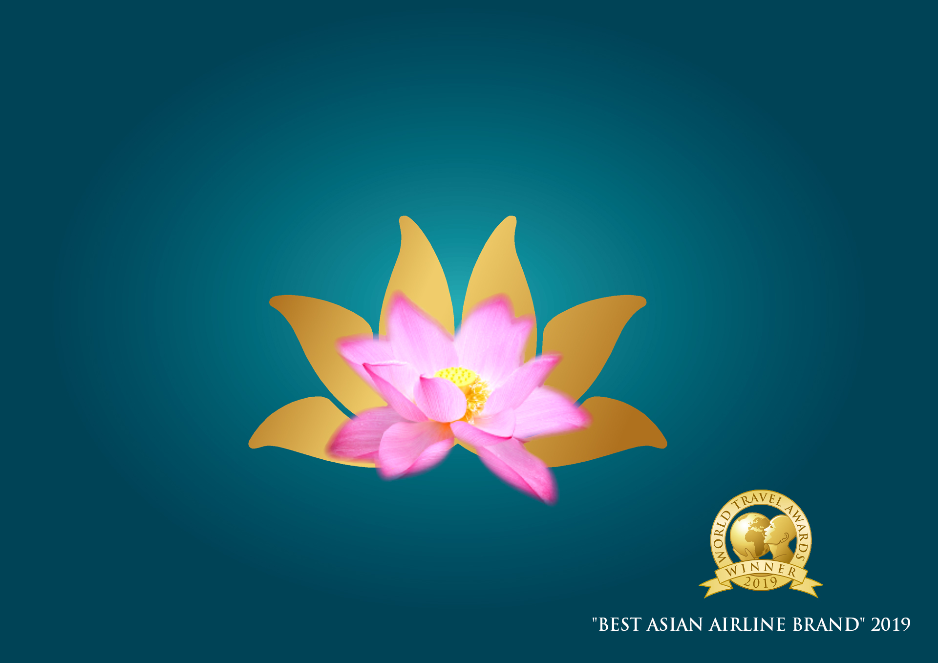
2015
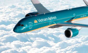
KUBO BRAND REFRESH LOGO AND 787-9 LIVERY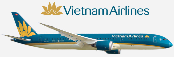
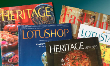
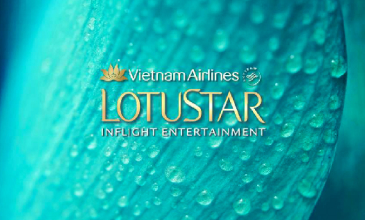
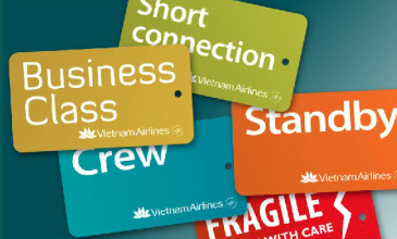
2002 BRAND SUPPORT MATERIALS
EXAMPLES OF 2002 REBRANDING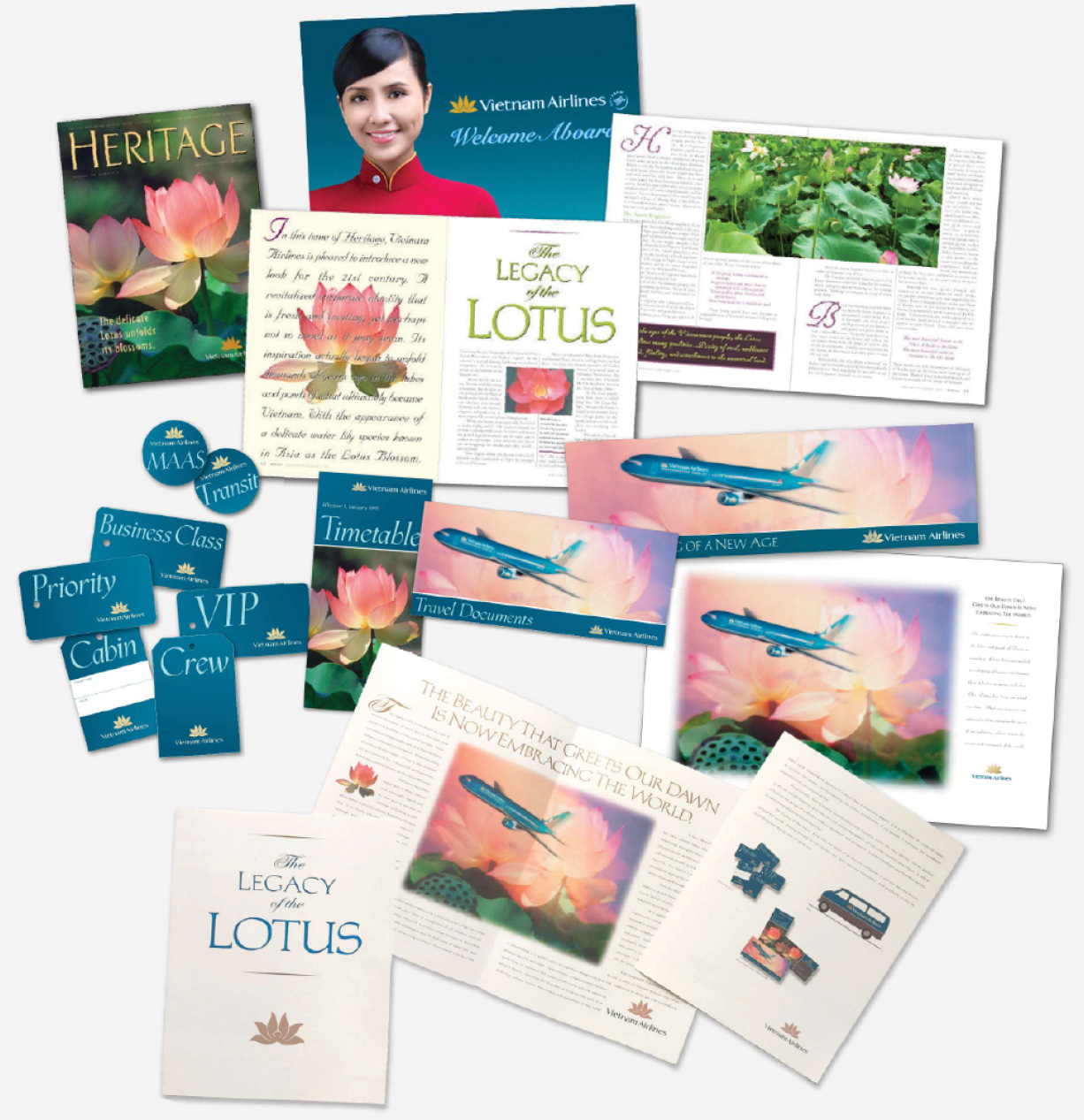
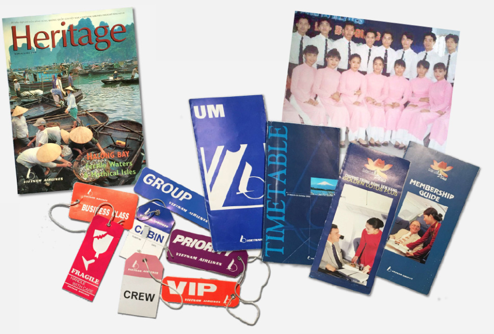
As a young airline of a newly emerging nation, it was important for Vietnam Airlines’ new brand to be highly professional while cautious not to over-promise. Therefore, the objective of Kubo’s rebranding effort, as shown above, was focused on establishing a vibrant new look that was meaningful to the airline, inspiring to the Vietnamese people, and inviting to the international market. It also needed to be easy to identify, and uncomplicated to implement, while conveying a message of sophistication and professionalism. The new branding was designed for Vietnam Airlines to grow into, which they did rapidly and in impressive fashion. Examples of Vietnam Airlines collateral prior to Kubo’s rebranding work are shown below.
EXAMPLES OF THE ORIGINAL AIRLINE BRAND
BEFORE THE 2002 REBRANDING BY KUBO